Why Is My Shopify Store Not Converting (And How To Fix It)
")
Getting traffic to your Shopify store is only half the battle. The real challenge is turning that traffic into paying customers. If you’re seeing plenty of visitors but few sales, you’re not alone – many merchants struggle with conversion roadblocks at different stages of the customer journey.
In this guide, we’ll walk through common problems that cause Shopify stores to underperform. For each one, you’ll see what the problem really means, why it happens, and practical fixes you can start implementing today.
Common Shopify Conversion Problems and Solutions: At a Glance
| Problem | Why It Happens | How to Fix |
| Homepage has traffic but no clicks | Confusing layout, poor mobile UX, no clear direction | Simplify navigation, highlight top products, add urgency badges (e.g., “Trending”) |
| Product views don’t lead to add-to-carts | Weak CTAs, lack of trust, no urgency | Strengthen CTAs, add reviews, use badges for limited-time offers |
| Carts don’t convert into checkouts | Complicated checkout, surprise fees, lack of trust | Streamline checkout, offer free shipping, reinforce discounts with Flair promotions |
| Customers don’t return | Weak follow-up, no loyalty offers | Retarget customers, send win-back emails, promote bundles and repeat-purchase discounts with Flair |
| Visitors bounce quickly | Slow load times, unclear value proposition | Improve site speed, clarify USP, reduce intrusive pop-ups |
| Discounts don’t drive sales | Promotions are hidden or inconsistent | Highlight deals with Flair badges, add urgency signals, keep offers consistent across channels |
Problem 1: My Homepage Has Traffic but No Clicks
What This Means
You’re getting visitors to your homepage, but they aren’t clicking deeper into your store, leading to high exit rates. This creates a bottleneck where traffic stalls before shoppers even see what you sell.
⚠️ Disclaimer: Let's assume you're seeing decent traffic quality and targeting the right traffic sources. Otherwise, you're likely facing higher-level issues with your brand identity and audience, which we don't have space to explore in this article. Instead, check out E-commerce Strategy 101: Your Comprehensive Guide.
Why It Happens: Common Causes
-
Overloaded or confusing website design – When your homepage tries to show too much at once, shoppers don’t know where to click and often leave without exploring further. \
-
Lack of mobile optimization – If your site is hard to navigate or slow on mobile, visitors quickly bounce, since most Shopify traffic now comes from smartphones. \
-
No clear direction to products – If you don’t guide customers to collections or featured products, they may not know what to do next.
How To Fix It
Simplify and Prioritize Mobile UX
As of Q2 2025, smartphones drive the majority of e-commerce activity, with 77% of retail site traffic and 69% of online shopping orders coming from mobile devices. That means your Shopify homepage needs to be mobile-first. Improve the mobile user experience (UX) by adding large tappable buttons, like coffee brand BLK & BOLD does here:

Other mobile optimization steps include adding a clear site structure, clean navigation, and fast-loading images so shoppers can explore easily without friction.
Highlight Your Top Products or Collections
Shoppers shouldn’t have to scroll to find your bestsellers. Feature them above the fold so visitors instantly see what you offer. Spotlighting a few popular products or seasonal categories helps guide customers deeper into your store. For example, notice how Hiut Denim Co adds a row of collections and a row of product links right below the hero image on its homepage:

Use Urgency and Credibility Signals
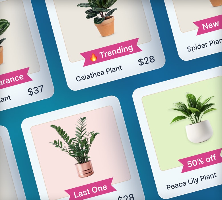
Product badges like “Bestseller,” “Low Stock,” or “New Arrival” help visitors know what’s worth clicking on. Or take a leaf from Maguire Shoes’ book and use homepage product badges to highlight new releases and restocks:

With Flair, you can automatically add badges like these to products, drawing attention and nudging shoppers to explore further.
🤓 Pro tip: Learn more in The Ultimate Guide to Product Badges
Problem 2: People Browse Product Pages But Don’t Add to Cart
What This Means
Shoppers are viewing your products, but they leave without adding anything to their cart – a sign that your product pages aren’t convincing them to take the next step.
Why It Happens: Common Causes
-
Poor product imagery – Uninspiring and/or unclear imagery hurts your store’s conversion rate because it doesn’t sell your product effectively. \
-
Weak CTAs or uninspiring product copy – If your product descriptions and buttons don’t make it clear why someone should buy, shoppers won’t feel motivated to act. \
-
Lack of trust or social proof – Without reviews, testimonials, or reassurance, visitors may hesitate because they aren’t sure your product will meet their expectations. \
-
No urgency to act – If nothing signals that an item might sell out or a deal could expire, shoppers often delay their decision and leave without adding to cart.
How To Fix It
Strengthen Your CTAs
“Add to Cart” can feel generic. Try experimenting with call to action (CTA) copy variants like “Buy Now,” “Get Yours Today,” or “Add to Bag.” Pair them with bold buttons and place them high on the page so shoppers can’t miss them, just like accessories brand Troubadour does here:

Add Social Proof and Reviews
People want reassurance before buying. Adding customer reviews, testimonials, and star ratings builds trust. If possible, use lifestyle photos or user-generated content to show your products in real-world use. For instance, footwear brand Rothy’s adds multiple in-depth review cards to every product page, featuring the customer wearing the shoes they’re reviewing, plus their verdict on how it fits:

Highlight Promotions and Limited-Time Offers
Create urgency by showing when an item is part of a special deal, like phone accessories brand Pela does here:

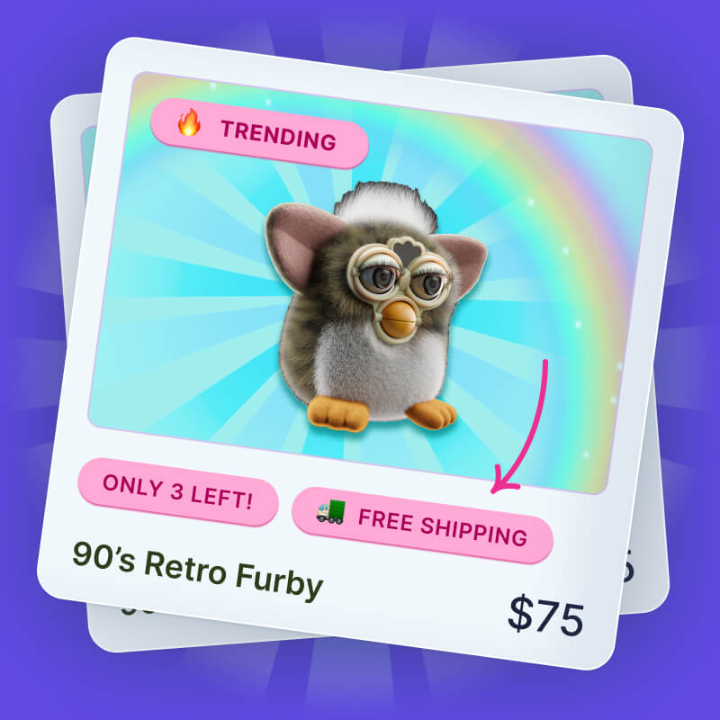
For even better results, use an app specifically designed to help conversions like Flair to add product badges like “Limited Time Offer” or “20% Off Today,” encouraging shoppers to act quickly.
🤓 Pro tip: Learn more in How to Create Sales Urgency on Your E-Commerce Store
Problem 3: Shoppers Add to Cart but Don’t Complete Checkout
What This Means
People are interested enough to add products, but they drop off before completing payment – a classic sign of checkout friction.
Why It Happens: Common Causes
-
Long or complicated checkout flow – The more steps you make shoppers go through, the higher the chance they’ll give up before finishing their order. \
-
Unexpected fees (shipping, taxes) – Hidden or last-minute costs create friction and result in more abandoned carts. \
-
Lack of trust signals or payment options – If checkout doesn’t feel secure, or customers can’t pay with their preferred method, they may drop off before buying.
How To Fix It
Streamline the Checkout Process
The more steps at checkout, the more chances customers have to abandon their cart. Speed up the process using express checkout services like Shop Pay and Google Pay, just like interior decor brand Goodee:

Beyond this, make sure to reduce unnecessary form fields and allow new customers to checkout as guests rather than creating an account (encourage them to do this later to track their order).
Offer Free Shipping Thresholds
Shipping costs are one of the biggest reasons for cart abandonment. Setting a free shipping threshold (e.g., “Free Shipping Over $50”) can encourage customers to complete checkout – and even add more to their cart. Even better, follow Duradry’s lead by adding a progress bar to your cart drawer so shoppers can see how close they are to unlocking free shipping:

Build Trust with Reassurance Signals
Add SSL badges, secure payment icons, and clear return policies at checkout. These small details help reassure buyers that they’re safe to complete the purchase.
🤓 Pro tip: Learn more in Trust Badges for E-Commerce: 10 Types You Can’t Ignore
Reinforce Discounts and Urgency
Use Flair promotions to keep discounts visible in the cart. A badge like “Extra 10% Off Today” reminds shoppers they’re getting a deal and encourages them to finish checkout.
Problem 4: Customers Buy Once But Never Return
What This Means
You’re able to secure the first purchase, but customers don’t come back – leaving money on the table and making growth harder.
Why It Happens: Common Causes
-
Weak post-purchase follow-up – If you don’t communicate with customers after their first order, they may forget about your store entirely. \
-
No incentives for loyalty – Without perks like discounts or bundles, there’s little reason for shoppers to come back rather than buying elsewhere.
How To Fix It
Send Cart Recovery and Win-Back Emails
Abandoned cart emails and post-purchase win-back flows help you re-engage shoppers who might otherwise forget about your store. Here’s an example from health product brand Rael:

You can even experiment with adding incentives like discounts or bundles to encourage orders.
Promote Loyalty Incentives with Flair
Use Flair promotions to highlight bundle deals or loyalty offers to returning customers. Badges like “Buy Again & Save” or “Bundle 2 For 10% Off” make the value clear and encourage customers keep coming back for more.
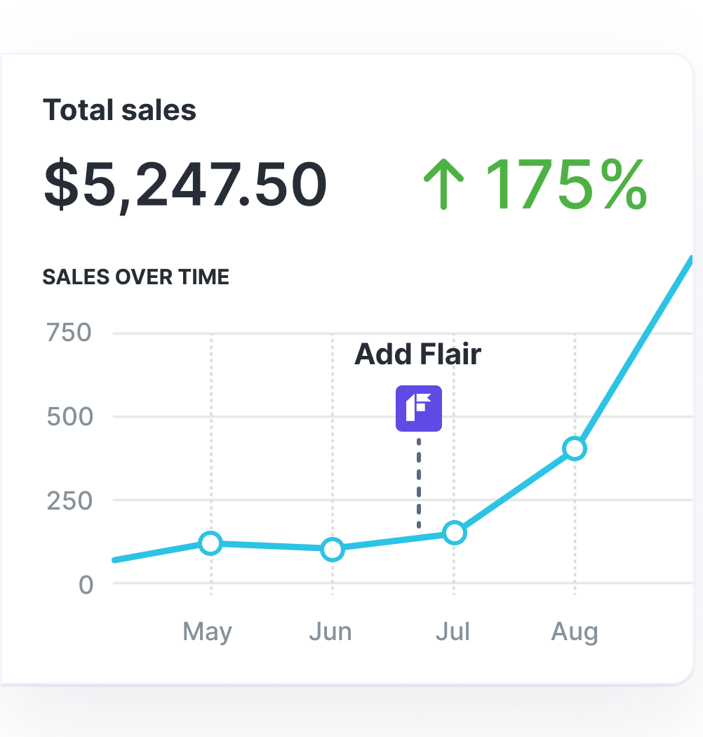
Grow Your Shopify Sales by over 175% with Flair
-
Increase sales using product badges and sales banners
-
Maximize conversions with scarcity, urgency and countdown timers
-
Automate promotions with targeted rules and scheduling
Problem 5: Visitors Bounce Quickly After Landing
What This Means
Shoppers land on your store but leave almost immediately without exploring further – meaning your first impression isn’t strong enough to hold attention.
Why It Happens: Common Causes
-
Bot traffic inflating store traffic – Your site analytics might be skewed by bots, so try to identify and block them to give an accurate picture of your traffic. \
-
Irrelevant/badly aligned ads – Mismatches between ad targeting and landing page copy can make shoppers feel like they’ve arrived in the wrong place. \
-
Slow load times, especially on mobile – If your site takes too long to load, many shoppers will exit before even seeing your products. \
-
Weak or unclear value proposition above the fold – If it’s not obvious what makes your store unique, visitors may decide quickly that it’s not worth browsing. \
-
Pop-ups or clutter that turn visitors off – Too many distractions on arrival can frustrate shoppers and cause them to leave immediately.
How To Fix It
Improve Site Loading Speed
A slow site is a conversion killer. Run your store through Google PageSpeed Insights to identify specific performance issues and get tailored recommendations.

Also, remember to compress your images and avoid heavy third-party scripts that slow down loading. Faster sites keep shoppers engaged and reduce bounce rates.
Communicate Your Value Proposition Clearly
When visitors land, they should instantly know what makes your store unique. Use a clear headline above the fold, supported by visuals of your best products. This helps shoppers quickly understand why they should stay. For example, gardening subscription box brand Pot Gang makes it clear that it gives customers everything they need to grow fruit and veg from home:

Keep Pop-Ups Minimal and Well-Timed
Pop-ups can be useful for capturing email sign-ups, announcing promotions, or offering first-time discounts. But if they appear the second someone lands, they’re more likely to drive people away. Delay them until after a few seconds – or trigger them on exit intent for a better customer experience, like footwear brand TOMS did here:

Problem 6: Your Discounts Don’t Boost Sales
What This Means
Even when you run sales, conversions don’t increase – suggesting your promotions aren’t standing out or reaching the right people.
Why It Happens: Common Causes
-
Discounts are buried or unclear on product pages – If shoppers can’t see or understand your promotions and pricing easily, they may miss them entirely. \
-
Customers don’t feel urgency around the offer – Without a clear deadline or scarcity signal, buyers may think they can wait and end up not purchasing. \
-
Promotions aren’t targeted effectively – If discounts aren’t promoted across multiple channels, shoppers may never notice them in the first place.
How To Fix It
Make Discounts Impossible to Miss
If your discounts are hidden, customers won’t notice them. Use product badges like “20% Off Today” or “Flash Sale” directly on product images so deals are visible at a glance, like this example from United By Blue:

Add Urgency With Timers or Low-Stock Signals
Shoppers act faster when they know time or inventory is limited. Conversion apps like Flair can automatically add urgency badges like “Only 3 Left” or “Ends Tonight” to make promotions more compelling.

Promote Offers Consistently Across Multiple Channels
Don’t rely on a single banner. Share promotions in emails, social posts, and on-site messaging so customers see the discount wherever they interact with your brand.
Just as importantly, make sure the offer is consistent across channels – if an email promises “20% Off Today,” that same discount should be front and center on the landing page. For example, when flower delivery brand Bloom & Wild sent an email containing a 25% limited-time discount, it made sure customers who clicked through were presented with the following notification:

Aligning your messaging builds trust and prevents drop-offs caused by confusion or disappointment.
Conclusion
Conversion issues don’t happen for just one reason – they crop up at different stages of the funnel, from homepage clicks to repeat purchases. The good news is that each problem has a solution, and even small improvements can add up to big results.
Flair can help at multiple points in the journey – adding urgency, highlighting discounts, and making your promotions stand out. That means more clicks, more sales, and more repeat customers.
Ready to boost your Shopify conversions? Try Flair free today and start turning visitors into buyers.
FAQs
What is a good Shopify conversion rate?
According to Littledata’s benchmark report of over 2,800 Shopify stores, the average Shopify conversion rate is around 1.4%. Stores converting above 3.2% are in the top 20%, while those hitting 4.7% or higher are in the top 10%. If you’re below 1%, it usually signals issues with site experience or product-market fit.
How do I track my Shopify conversion rate?
You can track conversions directly in Shopify Analytics under the “Reports” section, or set up Google Analytics 4 for deeper insights. Look for metrics like “Online Store Conversion Rate” and break it down by traffic source to spot problem areas.
Do product badges really increase sales?
Yes – product badges can improve conversions by adding urgency, scarcity, and social proof. Labels like “Low Stock,” “Bestseller,” or “20% Off Today” guide attention to the right products and encourage quicker decision-making. Apps like Flair automate this process so badges are always accurate.
What is the difference between traffic and conversions?
Traffic measures how many people visit your store. Conversions measure how many of those visitors take a desired action – usually making a purchase. High traffic with low conversions means you’re bringing people in but not persuading them to buy.
How long does it take to improve Shopify conversions?
Some fixes – like adding product badges or simplifying checkout – can have an immediate impact. Others, like building trust with reviews or running retargeting campaigns, may take weeks to show results. The key is to keep testing and optimizing over time.
Learn How to Double (2X) Your Shopify Sales with Product Labels
-
Boost sales by highlighting key features with product badges
-
Increase conversions by promoting scarcity, urgency and social proof
-
Sell more with targeted promotions to increase average order sizes