How to Improve and Optimize Your Shopify Product Pages

In an ideal world, every person who visits your Shopify store would buy something.
But this isn’t an ideal world, and average e-commerce conversion rates are actually pretty low, fluctuating between 1.68% and 2.28% in 2023:

So even on a good day, just two in every 100 shoppers will make a purchase.
Ouch.
Fortunately, improving Shopify product pages can make a huge difference. By focusing on key optimization strategies, you can boost conversions, build trust, and even drive more traffic to your store. Read on for everything you need to know, including:
- What is product page optimization?
- Why is it so important?
- What are the key elements of optimized product pages?
Let’s dive in!
What Is Product Page Optimization?
Product page optimization is about improving various elements of your product pages, with the ultimate goal of generating more traffic and sales.
To be clear, when we say “product page”, we’re talking about regular pages containing product information that is accessible through your store’s main navigation, like this one from Hiut Denim Co…

…rather than standalone product landing pages that can only be reached by clicking an ad link.
Why Is Product Page Optimization Important?
Clearly, it’s in your best interests to optimize every page on your store. But let’s examine the specific benefits of product page optimization:
Increase Conversion Rates
A small improvement to your product page conversion rate can have a huge impact on your bottom line.
To illustrate our point, let’s do some quick math.
Shopify has an estimated average order value of $85. If 1,000 people visit your product pages in a month and convert at a rate of 2%, you’ll generate 20 monthly sales — equating to approximately $1,700 in-store revenue.
After some smart product page optimization, your conversion rate climbs to 2.5%. Suddenly, you’re making 25 sales a month, earning you $2,125. That’s an increase of $425.
Nice!
Build Credibility and Trust
This point ties in with the last one. Because if consumers feel they can’t trust your e-commerce store, they won’t buy from you.
Conversely, they’re happy to pay a premium to shop with retailers they trust. Nine in 10 shoppers will pay more for products from trusted brands, with the average consumer prepared to spend 25% more on products from brands they trust.
That’s why adding trust factors to product pages is a key part of the optimization process.
Pro tip: We’ll discuss trust signals later in this article. But for more guidance, check out our article: 17 Ways To Create Trust on E-commerce Sites.
Improve SEO Performance
It stands to reason that the more traffic your product pages generate, the more you’ll sell.
Chances are, most of your product page traffic comes from shoppers clicking through from other parts of your store. But product pages can also generate traffic themselves by ranking for relevant keywords.
For instance, at time of writing, this product page ranked in the top 10 for the term “men’s blue linen shirt”:

New to SEO? Don’t worry — we’ll dig deeper into keyword-based optimization later in this article.
15 Key Elements of Optimized Product Pages
We’ve explained the “whys” of product page optimization. Now, let’s dig into the “hows” by sharing the most important elements of optimizing your product pages:
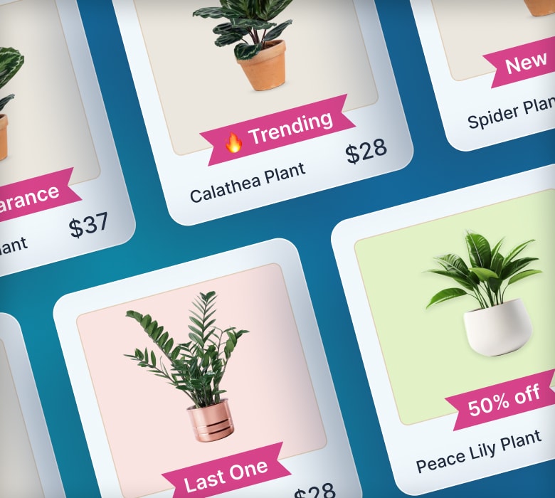
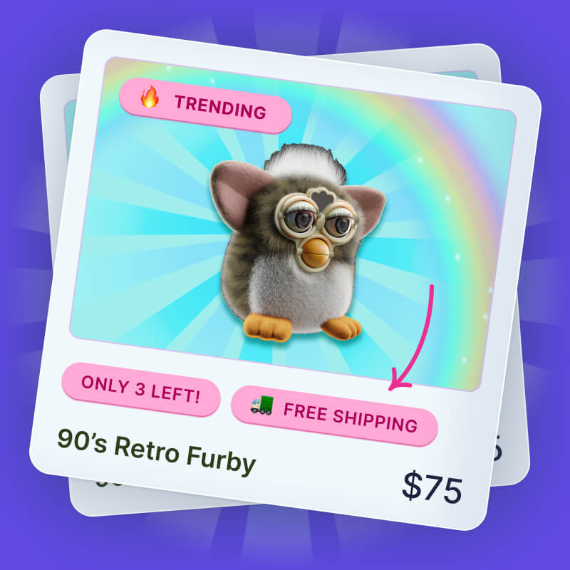
Product Badges To Showcase Promotions and Build Social Proof
The easier it is for shoppers to find your most attractive products and promotions, the more likely they are to buy.
That’s where product badges come in.
Adding badges, labels, and banners to product pages lets you:
- Highlight key product features and benefits
- Showcase your best-selling products and top deals
- Use countdown timers to drive urgency and scarcity

All of which can improve your conversion rate.
Grow Your Shopify Sales by over 175% with Flair
-
Increase sales using product badges and sales banners
-
Maximize conversions with scarcity, urgency and countdown timers
-
Automate promotions with targeted rules and scheduling
Clear, Compelling CTA
When customers click through to a product page, you want them to take action (i.e. buy something).
Don’t keep them guessing. Make the next step obvious by adding a clear, compelling call to action (CTA) button to your product page, just like this example from sustainable clothing brand Tentree:

Tentree went with the tried-and-trusted “Add To Bag”. But there are plenty of other options, depending on the types of products you sell. Here are some alternatives for different store types:
| Product Type | CTA Options |
| Physical products | Add To Cart
Buy Now Get Yours |
| Digital products | Download Now
Get Your [E-book, Video, Etc] |
| Subscription-based | Get Started
Sign Up Subscribe |
Be sure to A/B-test different CTA copy, fonts, colors, and locations to see which combinations result in the highest conversion rates.
Attractive Product Photography
We don’t want to state the obvious, but online shoppers can’t physically see, touch, or try on your products themselves. So your product page imagery needs to do all the heavy lifting.
Unless you’re selling a product with no real visual appeal (like memory cards or drill bits), you’ll want to use a combination of two image types:
- Product photography: Functional imagery that helps customers understand a product’s features and physical specifications, typically shot against a white background.
- Lifestyle photography: Aspirational imagery that shows the product in its natural environment, helping customers imagine what it’d be like to own it.
For example, coffee-maker brand Bruvi uses functional product photography to show off the packaging and shape of its De La Casa coffee pods…

…as well as adding aspirational lifestyle imagery to show the results of using the product — a delicious mug of joe:

Pro tip: Learn more about nailing product imagery in our guide: Shopify Image Optimization: Key Tactics.
Product Videos
Not all product pages need videos.
If you’re buying a pair of socks or some A4 paper, a product video isn’t going to add much value. In the worst-case scenario, it might even be an unwelcome distraction.
But video can be useful if you need to:
- Explain how a complicated product works
- Show the product “in action”
- Give customers a 360-degree view of how it looks
Sticking with the Bruvi example, you won’t find videos on product pages for “basic” items like coffee pods and travel mugs.
But the brand does add video to the product page for its coffee brewer bundle to better explain the product’s USPs:

Images of Product Variants
Product variants are a fact of life in many e-commerce niches, from beauty to fashion to interior decor.
Presumably, you want shoppers to know what those variants look like. Otherwise, how are they meant to know whether the product is right for them?
The most effective way to do this is to automatically switch your main product image when the customer clicks a different color variant, just like the cosmetics brand Beauty Bakerie does:

In-Depth Product Descriptions
They say a picture is worth 1,000 words.
But there’s plenty of space for both high-quality imagery and engaging copy on product pages, so it’s definitely worth spending some time on your product descriptions.
A quality product description should:
- Speak to the customer’s pain points (i.e. why they’d want to buy it)
- Explain the product’s features and benefits
- Help the customer picture what it’d be like to have the product in their life
Design marketplace Goodee gets it right with this product description:

Not only does it discuss the purpose of the Hoff Saucer and describe the high-quality materials, but it even recommends a potential cross-sell — the Hoff Planter.
And there’s another nice touch further down the page, where Goodee highlights the good causes that the product supports:

This is a big deal, given that 82% of consumers prefer a brand’s values to align with their own.
Consistent Branding
Sure, product pages serve a different purpose to other pages on your Shopify store, because they’re designed to fulfill a specific purpose: driving sales of a single product.
But you still want them to feel like part of the same site. Otherwise, you risk making the path to purchase seem disjointed, which can harm your conversion rate.
That’s why it’s important your product pages share the same branding and tone of voice as the rest of your store.
We think the chili sauce brand Fly By Jing gets it right.
As you can see, the brand’s homepage is packed with bold colors and punchy copy that speaks to the quality of its ingredients:

Its product pages are just the same — except perhaps even bolder, thanks to the yellow-on-black color scheme and striking product imagery:

All of which makes for a joined-up user journey, leaving no doubts that you’ve accidentally clicked through to a different site at some point during the process.
User-Generated Content
As the name suggests, user-generated content (UGC) is any type of content created by customers rather than brands, including:
- Reviews
- Testimonials
- Photos and videos of customers using a product
- Q&A content
When it comes to boosting sales, this sort of content is worth its weight in gold.
In fact, consumers who engage with UGC in some way are 102.4% more likely to convert than the average store visitor.
That’s why oral care brand Cocofloss lists prominent star ratings at the top of product pages…

…and also adds in-depth review and Q&A content further down the page:

Pro tip: Learn more about the power of UGC (and how to leverage it) in our guide: Enhance Trust and Credibility: Effective Use of Customer Reviews on Your Shopify Store.
Cross-Sell and Upsell Opportunities
The #1 goal of any product page is to sell the product in question.
But they also have a secondary goal: driving upsells and cross-sells.
There are various ways to achieve this.
For example, feminine care brand The Honey Pot includes a “Build Your Wellness Ritual” section on all its product pages, inviting shoppers to add a bunch of complementary products to their cart…

…while cosmetics brand Duradry uses the pop-out shopping cart window on its product pages to drive upsells and cross-sells with the promise of unlocking free shipping (and other perks):

Pro tip: Learn more in our guides: Shopify Cross-selling and Shopify Upselling.
Accelerated Checkout Functionality
Obvious as it might sound, customers are more likely to buy when you make the process quick and easy. And it doesn’t get quicker or easier than accelerated checkouts.
Shopify has its own accelerated checkout feature, Shop Pay. Per Shopify’s data, Shop Pay increases conversions by up to 50% compared to guest checkouts.
Not only that, but simply adding a Shop Pay button to your store can boost lower-funnel conversions by 5%.
Seems a little convenience goes a long way.
For that reason, we strongly recommend adding accelerated checkout buttons like Google Pay and Shop Pay to your product pages, just like personal care brand Meow Meow Tweet does here:

Pro tip: Find out more about Shop Pay in our guide: Does Shop Pay Check Credit? (Plus More FAQs).
Trust Signals
We’ve already mentioned that consumers have trust issues when it comes to buying from unfamiliar online stores. And who can blame them when 47% of social media users say they’ve fallen victim to some form of online shopping scam?
While you can’t reassure everyone, you can certainly mitigate this issue by adding trust signals to your product pages. This can include:
- Reviews and testimonials
- Logos from media sites that have praised your product
- Awards and accreditations from industry bodies
- Links to your social media profiles
- Recognizable payment badges
Apparel and accessories brand United By Blue clearly understands the importance of trust signals.
At the top of its product pages, you’ll find star ratings and a payment badge:

And there are additional trust signals further down the page, like the Yotpo icon next to its customer reviews…

…and the Certified B Corporation badge in the footer section:

All of which helps to reassure shoppers that United By Blue is a credible, trustworthy brand.
FAQ Section and Live Chat
Shoppers might have a bunch of questions about your products. And they’re not going to buy until they’ve found the answers.
Your product pages are the perfect place to provide this information. Because if you force customers to click deeper into your site to find what they’re searching for, they might get frustrated — in which case they’ll bounce.
Footwear brand Manitobah has three solutions for tackling this problem.
Firstly, it includes comprehensive product information — including technical specifications and a care guide — at the top of product pages:

Secondly, it offers an FAQ section below the fold, providing further details about how the products are made, how to look after them, and more:

And if you still haven’t found what you’re looking for, you can reach out to the brand’s customer support team via these contact icons:

Payment Options
Did you know that 13% of e-commerce shopping cart abandonments are caused by retailers not offering enough payment methods?
So, it makes sense to reassure customers that you support their favored payment solution.
ASOS does this by adding icons for all the payment methods it accepts at the bottom of every product page:
Simple but effective, huh?
Keyword Optimization
Remember earlier, when we spoke about the value of your product pages appearing in relevant search results?
It’s not only about generating more traffic — it’s also about reaching shoppers who are showing high purchase intent. Because if they’re actively searching for products like yours, you know there’s a good chance they’ll buy.
One easy (and free) way to find keyword targeting opportunities is to type a broad phrase into AnswerThePublic, which generates keywords based on autocomplete data from search engines like Google.
For instance, entering the term “ballet flat” produces results like:
- ballet flat mary jane
- ballet flat mesh
- ballet flat mary jane square toe
You can then add these keywords to your product page meta titles, meta descriptions, and body copy.
Which is precisely what footwear brand Maguire Shoes has done here:

Lead Capture Form for Out-of-Stock Products
Your customer has clicked all the way through to a product page, only to discover it’s sold out. Disaster!
But all’s not lost.
There’s still a chance of closing the deal — albeit at a later date. You just have to add a lead capture form to your product page so you can let your disappointed customer know when the object of their affection is back in stock.
Once again, Maguire Shoes gets it right here.
If your preferred shoe size isn’t available, just hit the “Waitlist” button…

…to sign up for notifications when it’s back in stock again:

As you may have noticed, Maguire also invites customers to its email marketing list, giving it the opportunity to share a bunch of other product recommendations and promotions.
Smart stuff!
Pro tip: This tactic doesn’t just apply to out-of-stock products — it also works for upcoming launches. Learn more in our guide: How To Use Coming Soon Products on Shopify To Accelerate Product Launches.
FAQ
What is a healthy product page conversion rate?
In 2023, average e-commerce conversion rates ranged from 1.68% – 2.28%, with the lowest rate recorded in February and the highest in November. However, these figures account for all e-commerce pages, not just product pages. We can assume product pages convert at a slightly higher rate as shoppers have progressed further along the buyer journey.
How do I edit a specific product page on Shopify?
Editing product pages on Shopify is easy. Just follow these steps:
- Log in to your Shopify admin.
- In the left-hand menu, click Products.
- Scroll through your list of products, then click the one you want to edit.
- Make the desired changes, then hit Save to update your product page.
What are the best apps for Shopify product pages?
Our favorite Shopify apps for product page optimization are:
- Flair, for highlighting your best products and promotions with product badges
- Judge.me, for adding customer reviews to product pages
- Bundler, for boosting upsells and cross-sells with product bundling
- Rebuy, for adding personalized product recommendations to product pages
- Shopify Inbox, for handling customer queries via chatbots and live chat
Pro tip: Find more app recommendations in our guide: Best Shopify Apps To Increase Sales.

