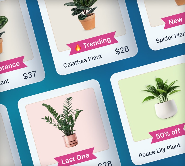
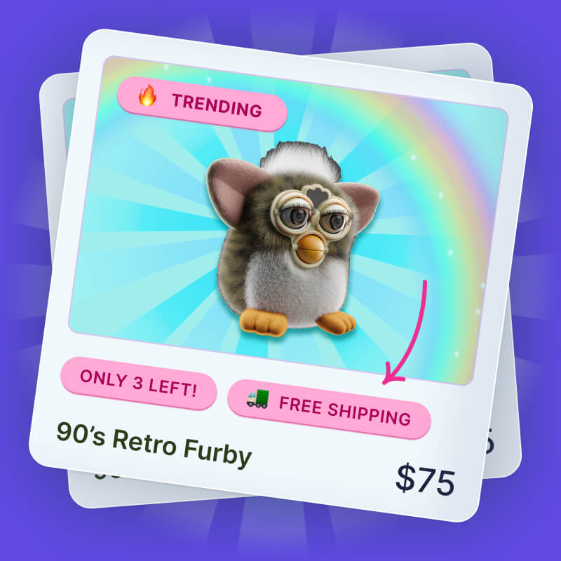
How to position product badges on top of product images

As you may recall, my Shopify app Flair product badges was originally designed to work best if the badges are not placed on top of product images.
The reasoning for this choice can be summarized as follows:
- Badges on top of images can interfere with the ability for customers to view your products which could impact sales
- Badges on top of images must use minimal text due to space limitations such as "New", or "Save" which may not convert as well
But every week or so I am asked a question similar to this one I recently received from Flair customer Paul:
We'd like the badges to sit on top of the product images in a collection's page. Can you do this?
The good news is yes Flair product badges can be placed on top of product images.
In today's post, I'd like to discuss putting product badges on top of your product images. We'll discuss:
- Why you might want to put badges on top of product images
- Before we get started...
- How to position a product badge on top of a product image
Why you might want to put badges on top of product images
As I mentioned, I am asked about putting badges on top of images fairly often. The most common reason I have heard for putting product badges on top of images is for cosmetic reasons — specifically to have collection items line up visually.
For example, when only some products have a product badge, the product details will not line up as seen here:

Putting the badge on top of your product image lets you can keep things lined up horizontally like so:

Depending on your Shopify theme, and perhaps also your preferences, you may be ok with things not lining up.
However, if you want to have your product details line up on your collection pages, you may want to consider overlaying badges on top of your product images.
Before we get started...
Before we get started showing you how to put product badges on top of your product images, I think it is important to list out a few prerequisites for this post.
For starters, this technique is fairly technical. You should have at least a basic understanding of Cascading Style Sheets (CSS). You should also be fairly comfortable modifying your Shopify theme.
In addition, every Shopify theme is different so these instructions may take a bit of finesse to get working within your particular theme. You can always safely make changes to your Shopify theme by making a backup of your theme before you attempt this so you can test it out before publishing it live to your store.
Sound good? Great then let's get started.
How to position product badges on top of product images
For this example, I'll be using the Shopify Minimal theme combined with badges created by my Shopify app Flair product badges. We'll cover:
- Adding a product badge to the collection product grid view
- A primer on relative CSS positioning
- Using CSS to position the product badge on top of the product image
Adding a product badge to the collection product grid view
The Minimal theme stores the collection product grid view in a file called snippets/product-grid-item.liquid. This is where we need to insert the code to add a product badge to items in our Shopify collections.
This step will be different for every theme, but most themes follow a similar pattern. We need to find the product image so we can insert our product badge relative to it.
The Minimal theme has this code (shortened for brevity) for displaying the product image:
<span class="grid-link__image{% if section.settings.show_sold_out_circle %} grid-link__image-sold-out{% endif %} grid-link__image--product">
  ...
  <span class="grid-link__image-centered">
    {% if featured.title != '' %}
      <img src="{{ featured.featured_image.src | img_url: 'large' }}" alt="{{ featured.featured_image.alt | escape }}">
      ...
    {% endif %}
  </span>
</span>
<p class="grid-link__title">{{ product_title }}</p>
On line 1 is a wrapper around the image and other built-in badges (not shown here) used by the Minimal theme. This wrapper is important for being able to position badges relative to the image as we'll see below.
If we weren't putting the product badge on top of the image, I would typically recommend inserting the product badge under the product title like this:
<p class="grid-link__title">{{ product_title }}</p>
{% include 'flair-product-badges' %}
On line 2 above, I am simply included the Flair product badges snippet. You could put any image or your own product badge code here as well.
However, since we need to put the product image on top of the product badge we need to go about this a different way which we'll discuss next.
A primer on relative CSS positioning
The best way to place a product badge on top of a product image is to use the CSS position property. As the name implies, the position property let's you control the position of different elements on a page.
CSS positioning can be a complex topic. To explain how this works, here is a simple diagram of how we need to set things up:

The product image wrapper which we discussed above needs to be set to position: relative. This is important as this determines how our CSS badge positioning will behave. Any elements set to position:absolute inside of the product image wrapper will position themselves relative to the image wrapper. So if we say top: 0, this will be the top of the image wrapper.
Then we will put the product badge inside of the product image wrapper and set it to position: absolute. The position: absolute let's the product badge flow outside of the normal page elements so it will not cause the other product details to shift around. We can then move the product badge relative to the product image wrapper as we'll see in a moment.
Using CSS to position the product badge on top of the product image
Using our example code above, we just need to move the Flair product badge snippet inside of the product image wrapper like so:
<span class="grid-link__image{% if section.settings.show_sold_out_circle %} grid-link__image-sold-out{% endif %} grid-link__image--product">
  {% include 'flair-product-badges' %}
  ...
  <span class="grid-link__image-centered">
On line 2, we inserted the Flair product badge snippet inside the product image wrapper. The Minimal theme already sets the product image wrapper to position:relative so we don't have to. If your theme does not you may need to add this CSS positioning yourself. If your badges end up positioned relative to the entire page or some other place this may be the culprit.
The last step we need to do is set the Flair badge CSS to position it. Flair badges use the CSS class flair-badge-wrapper.
Let's position the badge so it shows in the top left corner as seen here:

This is the CSS code that can be used to achieve this:
.flair-badge-wrapper {
  position: absolute;
  top: 0;
  left: 0;
  z-index: 10;
}
On line 2 we set the Flair badge wrapper position to absolute so we can move it relative to the product image wrapper. On line 3 and 4, we position the badge to the top left corner. You could also move the badge in pixels such as top: 10px to move it down 10px from the top. Likewise, you can move the badge from the left such as left: 10px to move the badge 10px to the right. The z-index property on line 5 is needed to ensure the product badge always sits on top of other elements on your theme.
Note: You can use a Flair badge layout to specify the positioning.
You can also position the badge relative to the right and bottom as seen here:

And here is the corresponding CSS:
.flair-badge-wrapper {
  position: absolute;
  bottom: 0;
  right: -10px;
  z-index: 10;
}Summary
Let's review what we just discussed about adding product badges on top of product images.
Many store owners want to put product badges on top of their product images. This is most commonly requested on Shopify collection pages to keep the product information visually lined up.
Keep in mind that putting product badges on top of images should be used with caution. You'll want to be sure the badges do not interfere with your customers ability to see your products or it could impact your sales. In addition, product badges on top of images need to use much less text so as to minimize the interference with your products.
You can use the CSS position property to overlay your badges relative to your product images. Using the CSS position property you can position your product badge relative to the top, left, bottom or right of your product images for complete control.
Happy product badge positioning.


