Flair Banners
Overview
Supercharge promotions with banners and countdowns.
Content
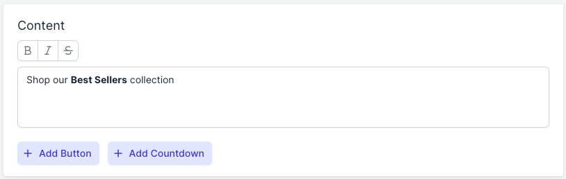
Enter the content for your banner. This supports text, emojis and dynamic text.
Button
Optionally add a call-to-action with a button.
- Click + Add button.
- Enter the button Text.
- Set the button Position.
Countdown
Optionally add a countdown timer to add urgency.
- Click + Add countdown.
- Set the countdown Position.
- Ensure the banner Status to set to Scheduled with a future end date.
Banner Style
Background Color
Choose the banner background color.
Border
Select the banner border size:
- none
- small
- medium
- large
Border Color
Choose the banner border color.
Corners
Select the banner corners style:
- square
- round
- rounder
- roundest
Letter Spacing
Select the amount of space to use between the banner letters.
Padding
Select the amount of space to use inside of the banner.
Shadow
Select the banner shadow:
- none
- small
- medium
- large
Text Color
Choose the banner text color.
Text Size
Select the banner font size.
Button Style
Background Color
Choose the button background color.
Corners
Select the button corners style:
- square
- round
- rounder
- roundest
Letter Spacing
Select the amount of space to use between the button letters.
Padding
Select the amount of space to use inside of the button.
Text Color
Choose the button text color.
Text Size
Select the button font size.
Text Style
Select the button font style:
- normal
- bold
- italic
- bold / italic
Countdown Style
Background Color
Choose the countdown background color.
Corners
Select the countdown corners style:
- square
- round
- rounder
- roundest
Gap
Select the amount of space to show between the countdown sections.
Labels
Enter the labels to use for the timer units:
- days
- hours
- minutes
- seconds
Letter Spacing
Select the amount of space to use between the countdown letters.
Padding
Select the amount of space to use inside of the countdown.
Text Color
Choose the countdown text color.
Text Size
Select the countdown font size.
Text Style
Select the countdown font style:
- normal
- bold
- italic
- bold / italic
Conditions
See the Flair Conditions guide for more information about conditions.
Status
Set the banner status:
- Published - the banner is live
- Unpublished - the banner is not live
- Scheduled - the banner is scheduled to be published or unpublished in the future
Link
Optionally add a link to your banner.
- Click + Add.
- Enter the URL.
- Optionally choose Open in new window to open the link in a new browser window.
Tags
Use tags to organize and promote specific groups of banners.
- Click + Add.
- Enter one or more tags.
See the Flair Layouts guide to learn more about group promotions.