How to Increase Landing Page Conversion Rate

A landing page is a standalone web page built specifically for a marketing campaign. As the name suggests, it’s where visitors “land” after clicking through from somewhere else, like an ad or email.
Here’s the thing: without an effective landing page, your campaigns are doomed to failure. You might spend thousands of dollars on paid search or social ads, only for clickers to leave without purchasing.
With that in mind, we’ve laid out 13 simple, tried-and-trusted tactics to level up your landing page conversion rate – and, best of all, they don’t involve any major redesign work.
Let’s get into it…
Common Issues Affecting Landing Page Conversion Rates
Before we dive into potential solutions, let’s take a look at the most common reasons why landing pages see low conversion rates:
- Low-quality above-the-fold content: The first thing people see when arriving on your landing page is the above-the-fold section. If it’s ugly, cluttered, or unengaging (or all three), visitors aren’t going to stick around and dig deeper into your offer.
- Unengaging imagery: If your landing page is designed to promote a specific product (or products), make sure you add attractive product imagery so visitors know exactly what you’re promoting.
- Slow loading speeds: For every one-second improvement in site loading speeds, conversion rates climb by an average of 17%. So the faster your landing page loads, the more leads and sales you’ll generate.

- Lack of responsive design: Smartphones account for 78% of retail site traffic and 68% of orders. So if your landing page isn’t mobile-friendly, it’s unlikely to deliver results.
- Too many CTAs: Every landing page should be optimized toward a single goal, such as capturing e-commerce leads or driving sales of a specific product. Don’t add different CTAs to your landing page – you’ll just distract and confuse visitors.
- Poor copywriting: Landing page copy should encourage your target audience to learn more about your offer by discussing specific pain points and benefits. If your page copy doesn’t compel people to read on, your conversion rate will suffer.
13 Simple Fixes for Low Landing Page Conversion Rate
If your landing page isn’t converting, there’s a good chance you’re struggling with one of the above issues ☝️ Overcome those problems using one (or more) of these methods…
1. Create Better Headlines and CTAs
Headlines and CTAs help you grab the visitor’s attention and guide them toward your desired outcome – most likely, buying your product.
Sadly, there’s no one-size-fits-all recipe for writing killer headline and CTA copy. But you stand a better chance of getting it right by following these tips:
👉 Align headlines and CTAs: Use headlines to engage landing page visitors, then seal the deal with your CTAs. Personal care brand Harry’s gets it right in the following example (the headline is the bit in the box; the CTA is the button we’re pointing at with the arrow):

👉 Give people a reason to act: In other words – why should someone take advantage of your offer? Popular tactics include sharing social proof and driving feelings of scarcity and urgency. We’ll discuss these in more depth later in this article…
👉 Use actionable language: Start your CTA with a verb, or doing word, so landing page visitors are totally clear on what you want them to do next. The right verb will naturally depend on the action you’re trying to drive and the terms of your offer, but common examples include “buy”, “shop”, and “order”. Skims keeps it simple in this example:

👉 A/B test headlines and CTAs: You might think you’ve written the world’s greatest CTA copy. But you won’t truly know it works until you A/B test it against other variants. Similarly, consider testing other design elements, like button size and location.
2. Add More Trust Signals
Trust signals are on-page elements that make your store and content feel more credible. Examples include:
👉 Review scores
👉 Secure payment badges
👉 Third-party accreditations
👉 Industry awards
👉 Testimonials
Adding trust signals to your landing page is especially important if you’re a comparatively unknown brand with lots of high-profile competitors, and/or you sell high-ticket products.
For example, D2C mattress brand Casper created a dedicated landing page to promote its 11th birthday sale – and used star ratings based on real customer reviews to make its products seem more legit:

Pro tip: Learn more in 17 Ways to Create Trust on E-Commerce Sites.
3. Optimize Landing Pages for Mobile
As we’ve already noted, the vast majority of traffic to e-commerce stores now comes from mobile devices. So if your landing page isn’t optimized for mobile, you’re likely missing out on a ton of potential customers.
The simplest thing you can do to ensure your landing pages are mobile-friendly is to choose a responsive Shopify theme. There are dozens of examples in Shopify’s official theme store.

Beyond this, there are some general pointers to bear in mind for building landing pages with mobile users in mind:
👉 Ensure buttons, links, and forms are large enough to be “tapped” – aim for minimum dimensions of 48 x 48 pixels.
👉 Take advantage of mobile-specific functionality like hamburger menus and swipe-enabled carousels, just like Gymshark does on its newsletter signup landing page:

👉 Add sufficient space between form fields so visitors can fill in the correct field without accidentally tapping one of the others.
You should also make sure your page loads fast on mobile. We’ll discuss this in more depth later in the article…
4. Share Social Proof
“Social proof” is a phrase that describes how we’re often guided by other people’s actions.
If everyone’s talking about a new Netflix show, there’s a good chance we’ll check it out too – especially if we think the people talking about it are smart and cool. And it goes the same for physical products. If shoppers think an item is in hot demand, they’re more likely to want it themselves.
But how do you make people feel like your products are trending? Try the following:
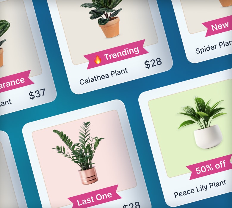
👉 Use product badges like “Bestseller” or “Back in stock” to demonstrate that a specific product is seeing a ton of attention and sales.
👉 Share user-generated content on landing pages so shoppers can see your product(s) being used by real customers.
👉 Add customer review scores to landing pages to demonstrate how many people have bought – and loved – your product. Bonus points if you add a “verified buyer” badge to reviews, just like United By Blue does here:

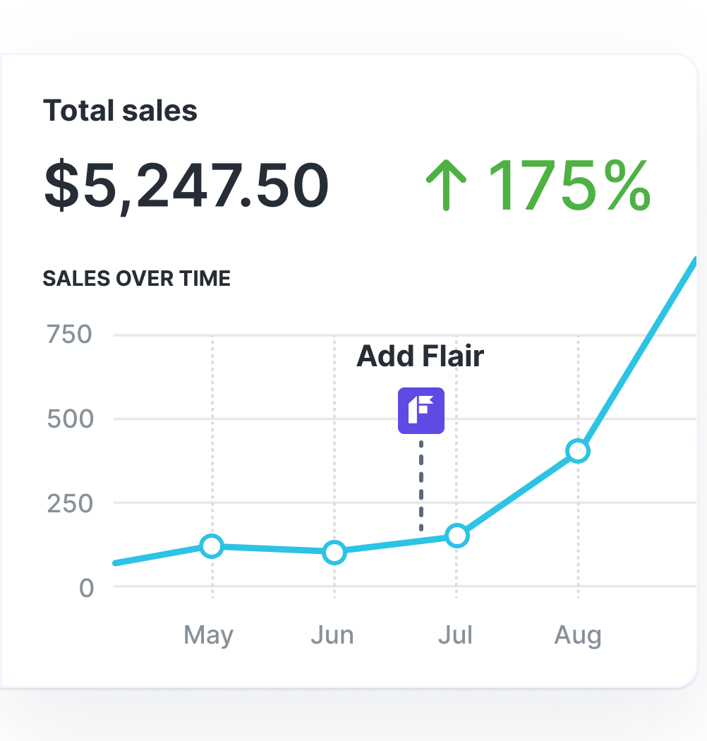
Grow Your Shopify Sales by over 175% with Flair
-
Increase sales using product badges and sales banners
-
Maximize conversions with scarcity, urgency and countdown timers
-
Automate promotions with targeted rules and scheduling
5. Boost Landing Page Loading Speed
As a general rule, faster landing pages convert better.
Google wants your pages to load faster – that way, searchers are happier, which means they’re more likely to keep using Google. That’s why the search engine has created a free analysis tool, PageSpeed Insights. Just plug your site in and check out the recommendations to speed up your store.

Of course, these measures are all pretty technical, so you’ll likely need a developer to help you implement them.
Looking for a “quick win” to speed up your landing page? Try compressing your on-page imagery using a tool like:
👉 TinyPNG
👉 iLoveIMG
They all work basically the same, reducing the size of your images without sacrificing quality, thereby helping your landing page load faster ⚡
Pro tip: Learn more in 10 Tips to Optimize Your Shopify Store Speed.
6. Improve Landing Page User Experience
Obvious as it sounds, your landing page is more likely to convert if it’s easy to use.
User experience is influenced by countless factors, from accessibility to speed (yep, that word again).
But, if you’re looking for a logical starting point that doesn’t involve a ton of complex design work, we’d recommend defining your landing page’s visual hierarchy – that is, the way you use visual elements to highlight important information and guide visitors deeper into your page.
Let’s take a look at the main elements that contribute to your visual hierarchy:
| Design element | Why it matters | How to use it |
| Size | Points visitors toward the most important information on a landing page. | Use larger sizes for more important design elements, like CTA buttons. |
| Contrast | Demonstrates the relationship between different design elements and adds visual interest. | Differentiate between different design elements by using different font sizes, color combinations, and textures. |
| White space | Guides visitors toward key page elements and makes your landing page feel less cluttered. | Add white space around design elements like buttons, forms, and blocks of text. |
| Alignment | Adds order to landing pages and makes your designs look more professional. | Consistently align different landing page elements, such as along the left/right edge or in the center of your page. |
| Directional pointers | Guides visitors along the path to conversion. | Use visual design cues like arrows to steer people down the page and toward CTA buttons. |
If visual design doesn’t come naturally to you, consider hiring a designer to build your landing page for you – if it improves your conversion rate, it’ll be worth the money.
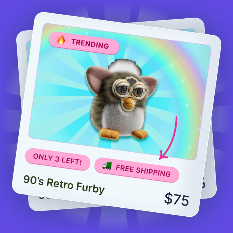
7. Add Scarcity & Urgency Messaging
One of the most effective ways to encourage visitors to take action right now is to add scarcity and urgency-related messaging to your landing page. For instance, you can:
👉 Add product badges like “Selling fast” and “Almost gone” to in-demand products.
👉 Use stock level product badges (like “Only X left!”) to highlight products that are close to selling out.
👉 Promote time-limited discounts using countdown timers and banners.
Pro tip: Learn more in While Supplies Last: 8 Scarcity & Urgency Tactics.
8. Add a Chatbot
Shoppers might have any number of questions about your product and customer support – and they won’t buy until they’ve found answers. This helps to explain why websites with AI chatbots see 230% higher conversion rates than those without.

One big benefit of AI chatbots is that they can answer frequently asked questions without forcing the customer to click away from your landing page.
That’s important, because landing pages are standalone pages built around specific audiences and offers – so once someone clicks through to one of these pages, you want to keep them there.
Think AI chatbots are only for enterprise-grade Shopify stores? Think again.
One of our favorite Shopify apps – Shopify Inbox – lets you help customers through AI-powered instant answers and suggested replies. And it’s totally free!
Pro tip: Check out the Best Shopify Apps to Increase Conversions.
9. Echo Ad Design & Copy on Landing Pages
Landing pages don’t exist in isolation – they’re the final destination for people who’ve clicked through from an ad, a marketing email, or some other campaign. So if you want to reassure customers they’re in the right place and create a seamless user experience, be sure to replicate the style and tone of your ad on your landing page.
For example, meal kit brand Blue Apron uses the following ad to promote a $150 discount for new customers:

Anyone who clicks through from that ad is clearly interested in the offer.
So it makes sense that the discount is the first thing you seen when you arrive on the landing page:

10. Place Key Page Elements Above the Fold
Landing pages are no place for wasted words.
But, even if all your messaging is important, some elements will be more important than others. That’s the sort of stuff you want to share above the fold (AKA before visitors have to scroll down).
For instance, fitness brand Peloton uses the above-the-fold section on this landing page to share its unique value proposition:

But you might also want to highlight other elements, such as:
👉 Personalized product features and benefits
👉 CTAs
One other key point here – bear in mind that the size of the above-the-fold section varies by device type. So, for example, there’s no point designing for desktop if 90% of shoppers visit your store on mobile.
11. Show Your Product in Action
It’s tempting to go all-in on detailed product imagery when designing landing pages.
After all, the whole purpose is to generate sales of a specific product – so why not show visitors a bunch of close-up images of the product in question?
Sure, you definitely want some product images on your landing page. But you should balance this with lifestyle imagery showing people who look like your target audience using your product “in the wild”.
Loop Earplugs gets this right by using lifestyle imagery to demonstrate different use cases for its noise-reducing earplugs:

Because these images feature actual people using the products, it makes the messaging more impactful by encouraging visitors to picture themselves wearing a pair of Loop earplugs.
12. Remove Landing Page Navigation
Most of the solutions in this article feature things you should add to your landing page – like product badges, review scores, and chatbots.
This next tip is different because it’s about something you should remove, namely your store’s top navigation bar (plus any other navigational elements, like a footer menu).
Fact is, once someone reaches your landing page, you generally don’t want them to click deeper into your store. Instead, you want them to stick around and convert. And you’ve got more chance of making that happen if you get rid of all your navigation options.
13. Add Exit-Intent Popups
Exit-intent popups are exactly what they sound like:
When a visitor shows intent to exit your site – AKA moving the mouse pointer toward the old “X” in their tab bar – these popups appear on-screen with a message urging them to change their mind.
For instance, underwear brand OddBalls offers shoppers 10% off their next order if they stick around and buy something:

Exit-intent popups aren’t right for every store. It’s hard to imagine a premium brand like Gucci begging customers not to bounce.
On the other hand, OddBalls gets away with it because their branding is pretty eccentric and their tone of voice is kinda tongue-in-cheek. And these popups are definitely worth trying, because they have an average conversion rate of 2.8% – not bad considering the target audience were in the process of leaving 👋
FAQs
What is a landing page conversion rate?
A landing page conversion rate is the percentage of page visitors who visit a landing page and perform a desired action, like submitting a form or buying a product. Landing page conversion rate is a valuable e-commerce metric because it demonstrates whether your messaging is persuading shoppers to take action.
How is landing page conversion rate calculated?
Landing page conversion rate is calculated using the following formula:
- (Total number of landing page conversions / Total number of landing page visitors) × 100
For example, if a landing page generates 50 conversions from 1,000 visitors, the conversion rate would be: (50 ÷ 1,000) × 100 = 5%
What’s a good landing page conversion rate?
A “good” landing page conversion rate depends on the type of action you’re trying to drive. For example, an email capture landing page will likely see a much higher conversion rate than a page selling a high-ticket product like a mattress or designer clothing. However, data shows that a conversion rate of 4.7% would put you in the best 10% of Shopify stores.
Learn How to Double (2X) Your Shopify Sales with Product Labels
-
Boost sales by highlighting key features with product badges
-
Increase conversions by promoting scarcity, urgency and social proof
-
Sell more with targeted promotions to increase average order sizes